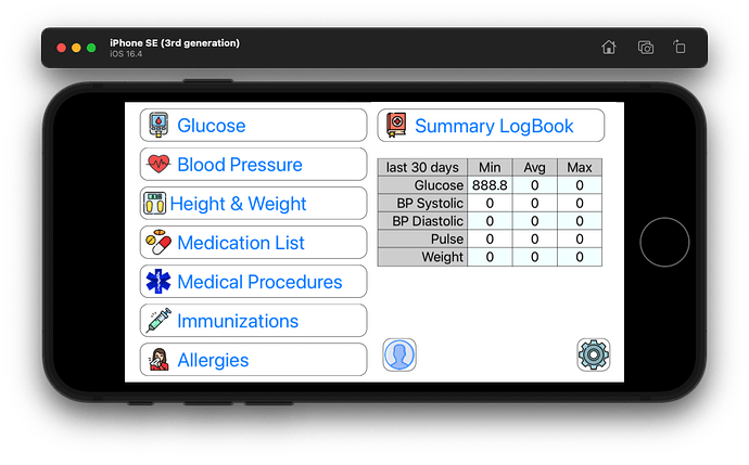
OR
bottom one
Thanks… that was my first layout…
Hm, personally I like the first one. Maybe it’s whether you want the actions or the summary front & center. I am a bottom-line sorta guy so I want the UI out of the way and the focus on the table. But … no idea how (a)typical I am.
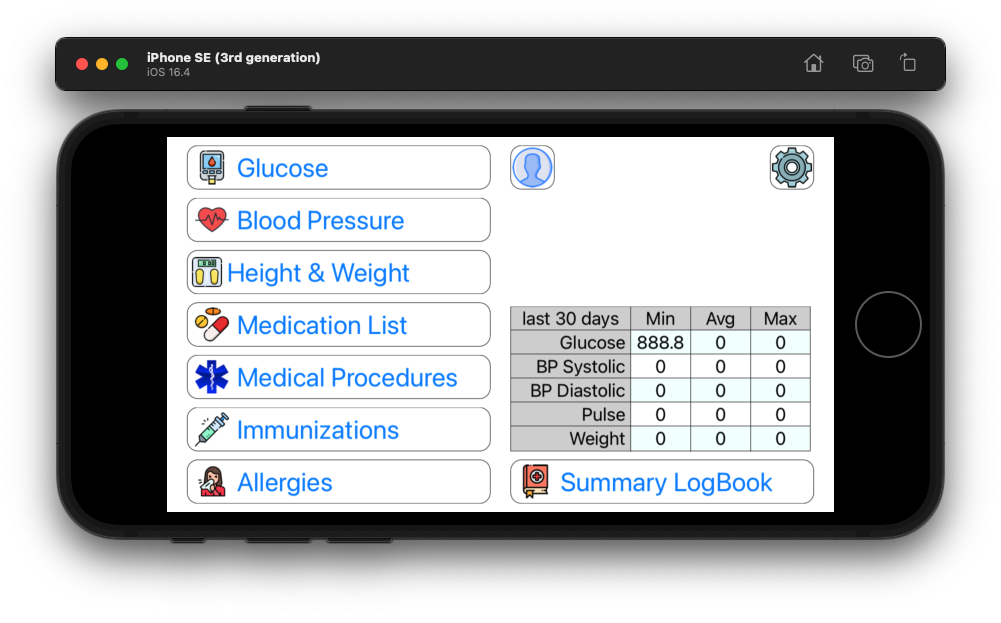
Second one but move the table up to the top aligned with the top of the GLUCOSE button & move the persons icon & settings icon down to the bottom right ?
how often do you expect someone to change overall settings ?
I’d put those two down in the lower right where they are still present but “deemphasized” based on a LTR reading style
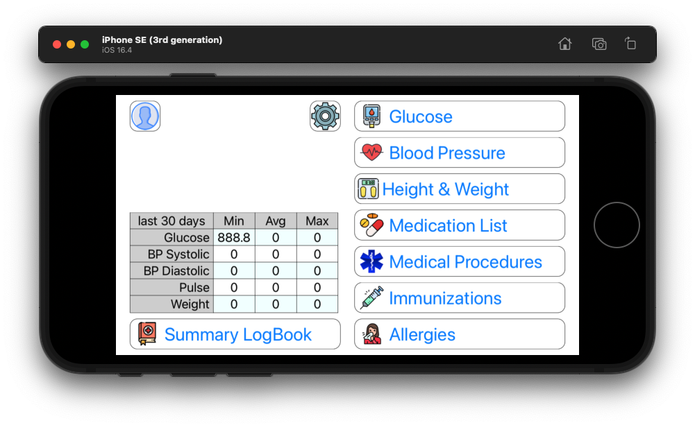
actually there is more information that goes in that blank area above the table, which I should have completed bfore making this post. Persons name, age and gender.
Note : that little table is display only
Bottom one.
Bottom one, the standard is Menu at the right. And on another topic, those icons / colors and rounded corners have a 90s vibe. Not apealing for many people
well I’m not a graphics artist, any idea what makes a 21st century icon?
FWIW I would order the table columns as Min, Max, Ave and highlight the Ave column background
( I assume if any of the values are out of the normal range the text would be bold red)
- Karen
yes… once I get there the cells will be colored based on where the value is in relation to “good” and “bad”. This is the first use of my iOSTable control
what app are those from?
Is my doctor’s web portal.
well originally I had this

instead of this

second one
sorry none, looks 1990ish to me…
I am really bad at UI design. The way out: hire a UX designer.
I really dislike the “modern” tiny flat monotone design esthetic… for me it makes it harder to recognize icons… and often makes makes screens visually boring!
- Karen