gee wish I was made of moeny so I could invest a $1000 into a program with an unknown revenue stream
so suggest an alternative?
No, because I do not know your app nor the functions nor the use-case. But I can tell you that there are HIDs for every platform
Nobody will use your app if it feels kinda “alien”. And this buttons clearly awkward with their captions and icons.
UI is one of the hardest aspects of being an indie developer. I’ve been working on an informational UI for over a month, I’ve probably created over a dozen different designs, none of which met my design goals.
So for the current design, I sacrificed some of my goals and it does seem to be flowing better. My current problem is that I want to support accessibility and screen reader (in the simplest way possible), which means that the text must be a native control (i.e. NSTextField or NSTextArea).
Getting multi-line NSTextFields to align with NSImageWells is a chore, I’m going to try a different tactic today to hopefully find some text position information from the NSTextField. At this point, I’m even going to look at private API.
I do too. I even created a skeuomorphic design, but I abandoned it because while I thought it looked awesome, it was really and I mean really, out of place. Plus being only a first draft it wasn’t polished and with skeuomorphic UI, the polish takes a very long time.
I want my UI to stand out in a positive way, not to instantly look dated, no matter how much I loved the skeuomorphic era.
The only advice that I can share with you.
Make a list of requirements.
You need consistency with the platform, but you also want it to be unique, people should be able to look at it and easily figure out what to do next, while at the same time it should be clear that they’re using your application.
Google example UI for the kind of UI you’re looking for. Cherry pick several example UIs and experiment. For instance the design I currently have, looks nothing like any of my research material, but you can kinda see how I ended up here.
Bounce multiple different designs off other people. You need some other developers in there, and you need some potential customers.
Experiment and don’t be afraid to throw away designs.
If you find yourself being unclear on how to expand the UI, it’s probably a bad design.
Maybe it is the small size that may look 1990…
Can you enlarge the icons ?
This is probably the app I wrote (about 15 years ago, but still in use by some people) that didn’t follow any existing guidelines.
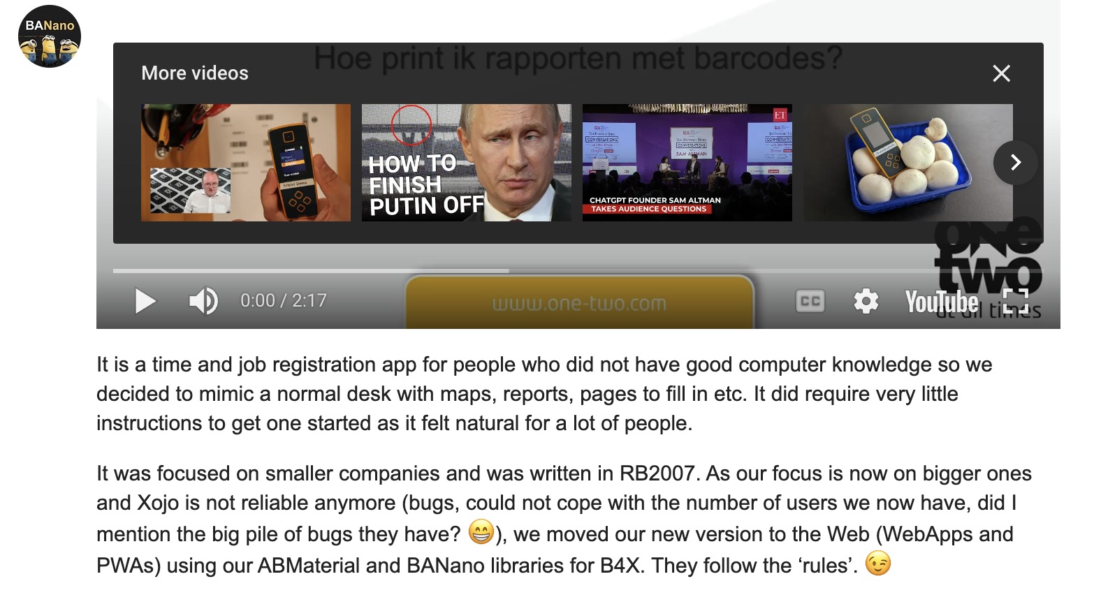
(put the videos in 1080p to see it better, some are in dutch)


It is a time and job registration app for people who did not have good computer knowledge so we decided to mimic a normal desk with maps, reports, pages to fill in etc. It did require very little instructions to get one started as it felt natural for a lot of people.
It was focused on smaller companies and was written in RB2007. As our focus is now on bigger ones and Xojo is not reliable anymore (bugs, could not cope with the number of users we now have, did I mention the big pile of bugs they have? ![]() ), we moved our new version to the Web (WebApps and PWAs) using our ABMaterial and BANano libraries for B4X. They follow the ‘rules’.
), we moved our new version to the Web (WebApps and PWAs) using our ABMaterial and BANano libraries for B4X. They follow the ‘rules’. ![]()
I usually purchase a design at ui8.net. They’re usually pretty inexpensive. I found some very good ones in the 20 to 35 USD range. They also have lots of free ones.
This one was 21 USD when I purchased it.
I then build the design in Xojo from the Figma file.
It doesn’t matter what it looks like as long as the users using it can do what they need to do. ![]()