one of the things mentioned in there is updating the IDE
I know Xojo has/had plans but no idea when they might get to it
And I’m aware there are some people who have made some efforts in that direction
But IF you had to redesign it what would YOU do ?
Sketches, images, mock ups, or really clear prose helps
Personally I have my own idea but I dont want to color anyones contributions
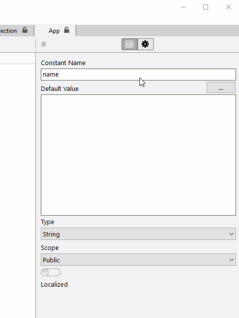
The user experience and productivity can be incrased a lot just by resizing the items in the inspector. We dont have 800x600 monitors, how long this change can take? A couple of hours?
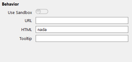
But istead, they are going the oposite direction. Edit HTML there:
EDIT : never mind
I see that one
Someones just not set things up right and indicated this should use a multiline editor I suspect
That would make this even more trivial to fix
On the other forum IIRC, I think Thom said that when Xojo IDE was first released, the current UI for that was meant to be changed in 2 or 3 releases, but it never happened.
It is the same problem with the new documentation’s search function, which is a relatively small box that does not resize to larger dimensions, only to smaller.
I see a misguided design pattern that is based on the assumption that devs work on iPad Pro-sized devices. Only, this does not reflect reality.
I’d probably take some queues from VS Code. For the current iteration of the IDE, Panic’s Coda served as a large source of inspiration, combined with browser workflows. The idea was, like a browser, everything you do stays in one tab and you make new tabs as you need. I think we’ll all agree, this didn’t really work out. From a high level, it’s… fine. But there are lots of edge cases that require breaking that paradigm, so I think it needs to go away. As much as I hate Real Studio’s tab overload issue, I think it’d be better than the tab behavior we have now. This is where VS Code inspiration comes in. Rather than the navigator being part of the tab, it should be at the top level so it can open new tabs as needed like Real Studio would do. What it does better than Real Studio is reusing tabs when possible. Tabs can be italic, which basically means they are temporary. If you click a different file that has no tab already, it’ll go into the next temporary tab. You can double click a tab to get it to stick around. Clicking a different file opens a new tab, unless there is already a tab for it. I think this could work for Xojo nicely.
It’s not perfect. VS Code will switch the file list to make sure the current file is selected and in the viewport as you switch tabs. I find that very annoying. Maybe there’s a setting for this, I don’t know, it has too many.
I think this tab change would go a long way to making the Xojo IDE more usable. The code editor also needs a lot of love. I think I’d prioritize getting the compiler integrated to provide more intelligent code assistance, and the previously discussed signature change.
There’s other stuff like the debugger that I think needs another try. Neither Real Studio nor Xojo really got the debugger right. But not having seen a debugger that I actually like, I’m not sure what I’d do to it beside making sure the values listbox autosizes its columns.
The debugger “pane” must be “openable” in its own window, so the debug process can be a joy (instead of a real pain). And those with multiple monitors (screens) will be able to accelerate the debug time.
Another simple thing is… the Break feature. It display the Break line just below the debugger area… when it opens. Read stupid.
At last, as other already said:
Remove these stamp TextArea à la Windows XP. “In the Add an event” “window”, there is only a bunch of events displayed and 800x600 monitors does not exists anymore !
I remember the time of the PowerBook Duo (210 / 230) when some window goes our of the available monitor height: the buttons were not available (but Return was usable). No one complained at the time.
The poet once sing “The Times They are a-Changin’”.
I keep seeing this number thrown around, but minimum screen sizes still must be really small. I think we targeted 1024x768 at the time. My current app uses 1280x720 now. Display scaling in Windows really complicates life since it very often defaults to something besides 100%. I believe Microsoft’s goal is to keep screen elements similarly sized between screens. So a 24” 1080p display will use more scaling than a 32” 1080p display to attempt to keep the buttons sized similarly. If I’m wrong, I haven’t a better guess at how Microsoft picks the default scaling factor.
Anyway… because of this, that 1080p display at 125% means there’s only 1280x720 to actually use on screen. Or just 960x540 if 150% was picked.
So physical screen resolutions may be bigger, but we’re still handicapped by these scaling factors.
I think you realize what Emile is getting at - no one really uses a monitor that small anymore. Your response is proof.
In context of this topic, you need to separate enduser displays from developer displays. I doubt there are very few, if any, Xojo developers that use a single, small display. Granted, when traveling we may be confined to a single laptop display, but even that is much bigger than 800x600. Besides, the interface should be targeting the majority, not the minority, and have features that allow sufficient operability on smaller screens, not the other way around.
I think the biggest issue with the navigator is that it not only represents projects items (roughly the equivalent of files in VS code) but also all the internal items in each file (events, properties, etc)
And this would let you navigate away from a single item and so the “focus” could easily get lost
Maybe each tab, when open, has a navigator JUST for that item constants, properties, events etc so you could NOT change focus away from it
That might be closer to the VS model yet still “Xojo” like - maybe ?
VS, not VS Code, even on MacOS has a pretty decent debugger that I’m rather liking
Havent touched VS code in some time now since I’ve been digging into C# on macOS since it makes native Apps and the code is more portable than Obj-C or Swift
This is what all the people who started before it was called Xojo say, but when Bob had me working on projects in RealStudio the one thing that slowed me down the most was having the project navigator being its own thing.
I definitely agree the method signature and parameters would be more useful above the code editor, but I strongly protest the removal of the sidebar navigator.
I think there’s some sort of balance between no navigator and the one that lets you jump around willy nilly which seemed to always result in people saying they felt ‘lost’ as they’d end up with several tabs all showing the same thing
The nice thing about that old style was one tab when opened was not able to jump around to other tabs and need some way to go back to where it started. It was “focused”.
And when editing a window it had its own small navigator that was just the controls & such
Again it kept you “focused” (or isolated or however you like to refer to it)
But it had its limitations as well
Things like find were their own tabs so it wasnt quite as nice an experience to do a search then see the results & the places it existed all at once. you bounced back and forth between tabs to do this. Sure you could have serve l find results open at once but which was which and was it current any more
In a way thats kind of what this thread was intended to bring out
What things in the new UI work well you’d keep
What things didn’t
I loved the Navigator (in RS, it was the “Project” tab) “being its own thing”. It was predictable and constant - I always knew that it would show what I expected - an overview of my entire project. The Xojo Navigator has a mind of its own and I never know what it’s going to do next.