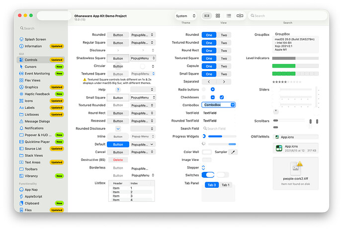
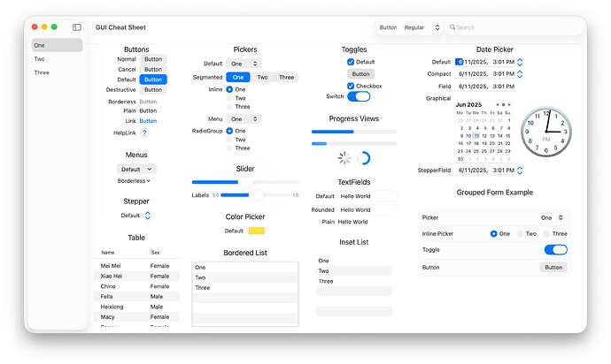
On macOS it seems tolerable, though I have some complaints around unused whitespace, and content mixing that seems odd. Folder labels changing folder colors is nice (25 years late), but the colors do not necessarily match the choices you make.
It may be a bug, but right clicking the desktop or adding icons to it seems to be missing now. And extreme translucency of widgets makes them hard to read. It looks pretty, and thats it.
On iOS it looks like slime… or uncooked egg yolk. It’s quite off putting and I’ve had to turn off all visual effects, because you can’t turn off only the sticky, gooey bits. It’s very uncanny valley at the moment, and I hope that goes away.
Using specific wallpapers makes it look nice on the springboard, but others make it look silly. A dark wallpaper I use now makes everything look flat-outlined white. The new blue iOS wallpaper looks fantastic with refractions on folders, etc.
The frequency of light text on a light background is something I hope they get a hold of (something Windows never really did), and the scrolling shadows are 1) fucking awesome 2) almost 20 years late 3) the shadows change color as you scroll, offsetting their usefulness with the aggravation of distraction and visual noise.
In some apps that visual noise is intolerable, as the wrapping refraction causes flashes and demands attention from something that should be out of the way.
macOS makes use of blurred backgrounds far more than iOS which makes it easier to use on desktop. Control center may be glass widgets now, but it’s readable against the blurred backdrop. Some color mixing of overlapping windows is nauseating but it largely works well.
The icon changes are bullshit, and feels very much like forcing everyone into a box. Even my apps that used the correct icon dimensions previously are now stuck in a grey box. And I don’t feel like fixing it because apple wants to sell more hardware.
I know people are comparing this to aero, but aside from the jarring glossiness of some controls that aero had, it was much more consistent, and evenly applied than lq, and much more reserved and out of the way.
It also looks like they’re removing some of the parallax effects, etc. from the older phones that had them previously, which is… quintessentially apple of the past decade, but no less irritating.


