What’s a standard way to visually show the status of something in a MacOS desktop app? (an indicator or something, more than just text)
e.g. connecting/connected/disconnected
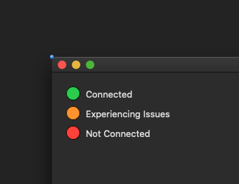
I see the MacOS UI guidelines only talk about progress or level indicators. What about binary/tri-state indicators? Checkboxes aren’t great because they always look like they’re changeable by the user, which isn’t the case in my app. I also want this status to be easily seen at a glance, from a ways away, so should it just be a big green/yellow/red circle?
Next, how about showing that something is available or unavailable? I was thinking an enabled/disabled (greyed) label, but that doesn’t seem to be a MacOS thing to have a greyed label (although it is in Windows)
e.g. Client Available, Client Not available
I’ve checked the MacOS UI guide, but I don’t see these things jumping out at me.
The guidelines are just that - guidelines for common situations
They USED to try & also give you design tips about WHY you should design something in a particular way. They do much less of that now.
Perhaps something nice & simple like a filled oval next to a label ?
As I said above, something like Client Available, Client Unavailable, being just informational, but highlighting it in some way when it’s Available. I would have thought enabled/disabled text, but MacOS doesn’t recommend that for labels.
You could color the text label as well although I would discourage that as it can be tricky to pick good contrast colors esp if people can switch between light & dark mode
Enabled / Disabled is more “is this control active” than anything
Usually when a dialog / windows is not active most controls will disable by default
So it may not be indicative enough