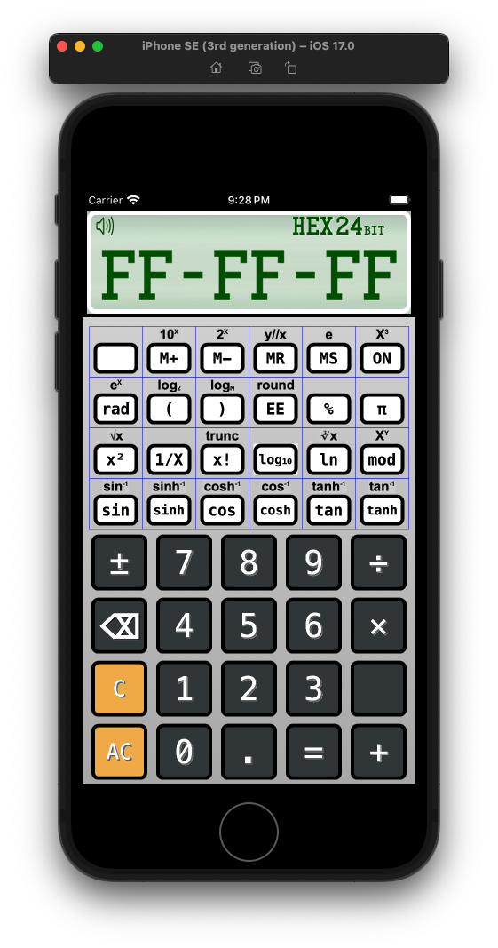
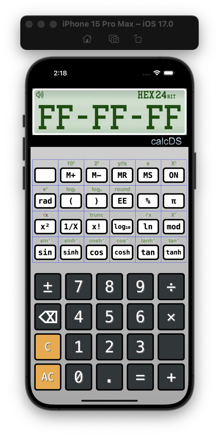
opinion please… This is the keypad for the Scientific version of my calc app… based on the one from the Programmers calc. I was thinking to change the paradighm for this calculator, by removing the GREEN labels, and having them appear INSIDE the button when the Shift key is pressed, doing so would allow for a bit larger font and make the sub/super script chars easier to read I think.
Arguing against: they are self-evident without having to “know” to press the shift key; personally I can read them fine; maybe it’s not clear which one is active at any given moment if they are both on the key.
Arguing for: It’s cool and might improve readability for some users.
Maybe a compromise is to put them in the button but bold them or make them a brighter color when the shift key is pressed – while un-bolding the unshifted legends.
damn it… you presented exactly the same arguments that I’d thought of… ![]()
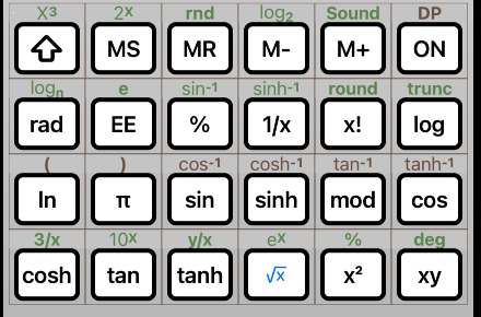
I’d though press shift and they SWAP
not both are in the key label
Press Shift again and they swap - again
So COSH starts as

Press Shift

and shift again returns it to the original
(excuse the image hackery)
thats kinda need idea…am re-engieering how the keypads are built, the current method is too long and complex… building a data-driven class instead
Show them both by default, swap on shift, and give the option to show one at a time.
They aren’t too small, they’re “just” the wrong color. The contrast ratio is very poor.
Thanks… thought that as well, but I was attempting to replicate the colors from the original device… but perhaps that isn’t a valid option
well as a test, I made them all BLACK and they are much more readable… Now to find a version of RED and GREEN with similar high contrast. There is another screen where the color difference is important