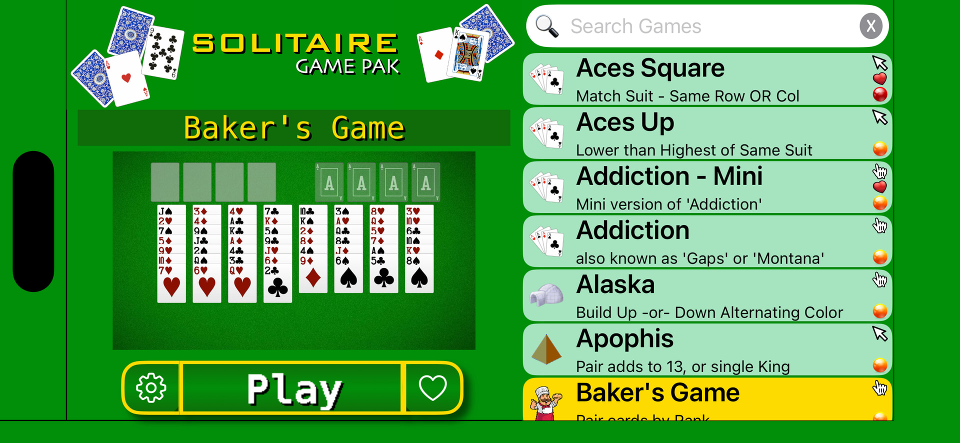
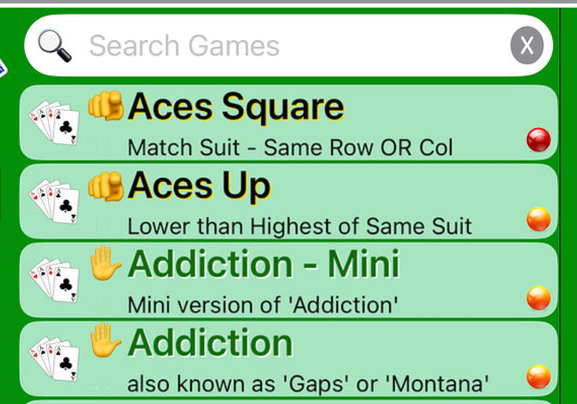
In this screen shot, Aces Up is a point-n-click style game, while Addiction is a drag-n-drop style
I would like a way for the user to easily discern the difference on this screen, but not sure I like the colors I chose… Anyone have ideas
Instead of the colored spheres, display a pointing hand and a grabbing hand icon?
the colored spheres are not the indicator… those show if you have played/won that game… the current indicator is the title of the game…
Regardless, a picture is worth a thousand [colored] words.
totally understand, however, there is not any real estate
You have space to prefix the name of the game with an icon to represent pointing or dragging.
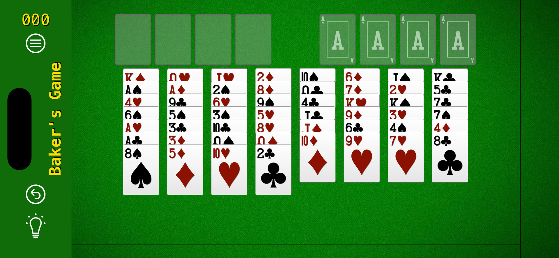
But on another note, to me, the cards under ‘Bakers Game’ look tiny and uninviting on this screen.
I imagine when play begins, they will occupy a lot more of the screen, but could the sample image be bigger, and the Play button smaller?