My "replacement"

Sorry… :smiley: … my ego got in front of me… and I had to “show off” a bit

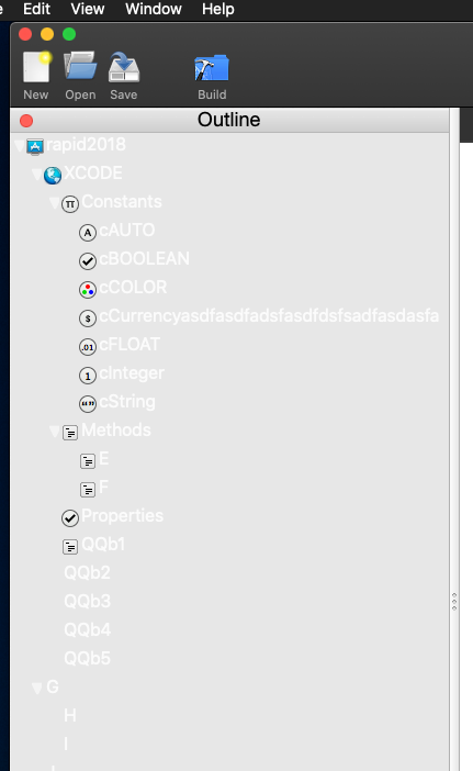
As I’ve mentioned in previous posts, I am attempting to create a “Xojo like” developement system… And recently started a ground zero rewrite in Swift. As a result, I am learning more about Swift (especially how its different on macOS than on iOS)… and have gotten the basic underpinnings of the main IDE screen (controls, but no “logic” yet)

This required me to create a bunch of custom controls.

  • a TreeView (I could have used NSOutline, and may still if I can find some decent docs)
  • a Toolbox gallery (grid of controls to drag to the designer)
  • an Attribute Inspector (That one was fun, but it works great)

So if anyone wants to see it so far (again, just controls with minimum interactions as of now)

www.rdsisemore.com/macOS_Test.app.zip

This is 100% Swift … It is signed, but not notorized

2 Likes

I know it doesn’t do much, but has anyone downloaded it, and have any comments/feedback?

Yes I know I “stole” a lot of the icons (not all)… but they are just placeholders for now, I will be replacing them after it gets operational

I did download it but I’ve been up to my eyeballs with projects so havent run it - yet

I promise I will

Pop’s up right fast !

I’m running Catalina in dark mode
The “navigator” test should be dark - its currently white on light grey


Probably need to have the icons in the “library” have light & dark versions for many of the same reasons as there are some that are black on dark dark grey
Thats true of the icons above the editor areas as well (could those be template images ?)

Things look ok in light mode
The navigator not being whatever it is they use in the Finder the expands & collapse widget is just … not quite right somehow almost looks like its a tiny bit clipped on the right edge when expanded.

I like the idea of having the layout designer having the different possible view immediately switchable from the popups in the bottom bar

In the inspector are the labels at left baseline aligned with the items they are next to ? they seem just ever so slightly misaligned

Being a native app you get a lot of neat stuff “for free” like all the options in the Windows menu (left tile right tile move to another monitor etc etc)

lunch break is over :slight_smile:

Darkmode is not fully supported yet… I want to get the UI all laid out and “working” before I attack that … And your observations about needing Dark/Lite icons would be correct :slight_smile:

Yes the Inspector is slightly mis-aligned… I still have to work out the exact dimensions so that the labels and controls of different heights line up exactly

I hadn’t thought about using template icons… Hmmm. that might work well actually

Thanks

heh yer gonna scream but autolayout has “baseline alignment” for most controls :stuck_out_tongue:
I know I know

LOL… no scream… no autolayout either

The interface looks nicer than B4X but there is a long way to go.

Some little niggles:

The ColorWell icon looks like a BevelButton.

When you click on a field in the Inspector the field should have the selection, not the row (is it a ListBox?)

The Inspector UpDown does not seem to have an UpDown …

yeah… well thats Apple … as I am using the NSColorWell control :slight_smile:
plus its the same as the Xojo one

you’re right… I forgot to add the updown widget
All the internal actions still need to be sorted out, and will be as I add the underlying dependent logic.
Its not a “listbox” in the Xojo sense, but it is a custom NSTableView embedded in a NSScrollView

Right now, the app just has a demo so I can test the various cell types…

besides the actual classes that make up the reusable control
here is how “simple” it is to make the Inspector

 theINSPECTOR!.addHEADER("SECTION HEADER",false)
        theINSPECTOR!.addSWITCH("sw","Switch",true)
        theINSPECTOR!.addINTEGER("int","Integer",32767)
        theINSPECTOR!.addDOUBLE("dbl","Double",3.14)
        theINSPECTOR!.addSTRING("txt","TextField","test stuff")
        theINSPECTOR!.addCOLOR("Clr","Color",clr)
        theINSPECTOR!.addPOPUP("pu","Popup",["a","b","c"])
        theINSPECTOR!.addSEGMENTS("sg","Segment",["a","b","c"])
        theINSPECTOR!.addBUTTON("xx","Button","caption")
        theINSPECTOR!.addUPDOWN("ud","UpDown",50,0,200)
        theINSPECTOR!.addSLIDER("sl","Slider",50,0,200)
        theINSPECTOR!.addHEADER("Future Items",true)
        theINSPECTOR!.addDATETIME("dt","DateTime","01/25/1956 01:40am")
        theINSPECTOR!.addDATEONLY("dO","Date","01/25/1956")
        theINSPECTOR!.addTIMEONLY("dt","DateTime","01:40am")

Norman is right - it opens super fast - This is neat and interesting to watch as you progress Dave!

1 Like

The final product won’t open quite as fast as it will been creating a in-memory database and a few other over head items… but that should be like a Second at most

1 Like

Put it into a separate thread and it will still open as fast …

Welcome Mike !

1 Like

@Norman: I see you’re allowed back onto the official forum :wink:

I am but not a lot to say there as I just read a few of the threads and chuckle to myself wondering when all those negative folks will get suspended too :slight_smile:

There’s a angst about when the next version will ship, what will be in it and the Testers channel has some threads that just expand on those themes (I think I can say that safely without revealing any details)

So I just keep on keeping on and report bugs and move on

This year will be “interesting”

Hi @mikecotrone - great to see you here!

Thanks Garry/Norman! :slight_smile:

Yes I have tried it, and it looks good. I am doing something similar in go.

For those of you interested (and I like getting feedback)… here is more “work in progress” for “my replacement”.

I have turned off support for DarkMode for the time being… I don’t know if the issue is Mojave or what… but a-lot of the system colors for backgrounds the should be shades of gray, are 100% white in light mode and 100% black in dark mode, and that isn’t right. So until I get that sorted (low priority), it will be forced to stay in light mode.

I fixed the expand/collapse widget in the TreeView, so it should look better now, the Inspector does more than before, and alignment should be tighter now as well.

As to the ColorWell… .it is now the exact same dimensions as the Xojo one (but the frame is thicker… but that is all Apple as it is a native control… If someone knows more parameters to affect the appearance let me know :slight_smile:

The Inspector Stepper control now works as it should have (I forgot to finish it before)… And clicking on a row, no longer selects the row, but affects whatever the embedded control is.

Also, this one has the opening sequence that will be in the final product. Where you select the type of project and basic configuration details. Note, AppleTV is visible and selectable, but will be disabled later (the ATV paradigm is much different that both macOS or iOS so I have some learning to do there… I just want the foundation up front)

This is coming together very nicely so far

And for comparison… I have an Xojo version that I wrote earlier this year that is at the exact same level as this Swift version… the core file (discounting frameworks and graphics) is 8.2MB for Xojo (23.9MB total), but only 2.4MB for Swift (14.2MB) total… which I thought was interesting :slight_smile:

www.rdsisemore.com/macOS_Test.app.zip

All comments, suggestions, feedback are welcome, and sought after

If I may make a suggestion.

I don’t know what language you will be using in your tool, but if you can build your components out of the chosen language, and include the source code in your IDE.

This way it allows a user to go in and edit the source code for that object, maybe even just on a project level. One thing I detest with Xojo is having to recreate an entire control to alter one little thing.

An example would be (fictionally) the ListBox, if this were native Xojo code and I could edit the source code, I could fix a whole of things that bug me about it, or add in some features that I want. Currently as it stands, to do these things, I have to create my own listbox replacement, which is a waste of my time, especially if I fix a bug, I could send the source code back, it get evaluated and then included in the next update.

Just something that if I were to create a programming environment something I’d do, after being on t’other side of the fence for long enough.

Well the “language” that a developer would use with this app will be a dialetic of “BASIC”, along the lines of the level the Xojo is … but the app itself is written in Swift, and all the controls will be either custom classes, or custom subclasses of existing AppKit controls . At first all that code will be just “files” includied into the Xcode project file that will be created from whatever the developer enters… But ultimately I will be precompiling those into an actual Swift Framework.

To create the controls in the destination language would mean the the app would need to be able to compile parts of itself, and the creates a whole new kettle of fish, as my app would have to do a massive amount of error checking to make sure its own components don’t have errors (since they could be altered externally). Right now I can optimize each one.

But until such time that they are in a “framework”, the Swift code would be visible, and what you suggest could be done.

1 Like