During my teaching career before chronic migraines took over my life, I wrote dozens of desktop Xojo applications to demonstrate visual perception and eye movement principles in the classroom, as well as applications for clinical use and two geometric optics applications.
Blockquote
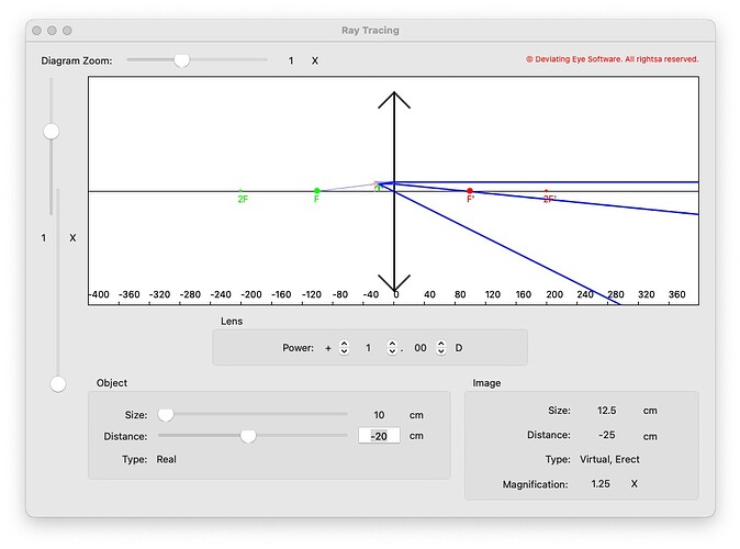
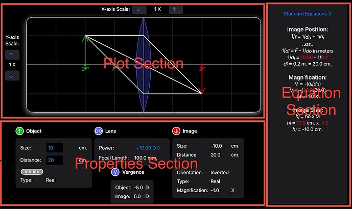
Recently I decided to start to port one of them to the iPad as a learning exercise. I started with one of the optics programs for thin lens ray tracing. Here’s a screenshot that I still had of what it looked like in Xojo (pardon the glitch in the vertical slider):
Rather than try to use the incomplete iOS libraries of Xojo, I was determined to bite the bullet and port RayTrace to Swift. For the user interface, I chose to try SwiftUI instead of Xcode’s Interface Builder and AutoLayout or imperatively creating views in code with UIKit calls, since Apple has been pushing SwiftUI for easier user interface creation and recommends using it for new programs. I wanted to see if the hype was true. I used the opportunity to improve the program too.
Apps for macOS and iOS are based on variants of the MVC design pattern (Model-View- Controller). The model contains the “business logic” of the app (or in this case, the optics logic), that is the data and calculations. The view part is the user interface.
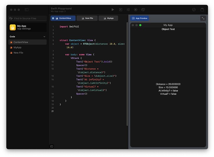
I used Swift Playground on my iPad to create the model so I could code from the comfort of my couch. Swift Playground allowed me to rapidly write the Swift code for the model without the delays of the write-compile-run development cycle. As you write code, you immediately see the results of that code in the Playground’s App Preview without the need to manually compile it. It’s comparable to running BASIC code in an interpreter while you’re typing in code. Here’s a simple screen that I made to display object properties as I wrote the class that defined an object. I could instantly see if I was making any mistakes. By modifying the statement that instantiates the object, I could test edge cases for that class.
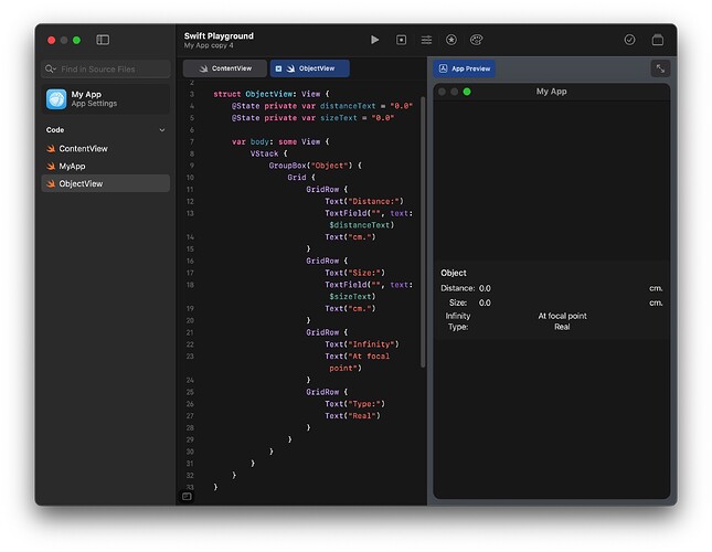
By the way, as you’ve probably surmised, Swift Playground’s App Preview is useful for starting to build GUIs too. Here’s the starting code for the Object properties section of RayTrace and the simultaneous feedback about its appearance:
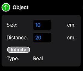
This let me start to flesh out a crude user interface and get feedback on how well my calculations were working at the same time. With a little extra work, I later got the Object properties section’s appearance to look more professional:
The full model for my app was a RayTraceModel class containing an RTObject class and an RTLens class for the optics object from which light rays originate and the lens that will refract those light rays, respectively. A third RTImage class is defined for the optical image created by the lens. An instance of this class is created as a computed property of the RayTrace class whenever the user asks for the value of the image, and because it uses RTObject and RTLens as inputs, it automatically updates if the RTObject and RTLens instances are modified. There’s no need to manually call an update() method to update the image any time the object or lens properties change. The RTImage class is small and calculated fairly easily, so there’s no detriment to computing it on-the-fly like this.
The model can be saved to a file or persisted with a little extra code by means of encoding/decoding the model object to JSON (easy with Swift’s Codable protocol) if the data is simple, or by using the new SwiftData library for more complex data. By persisting, the app will launch with the last-used model values and therefore resume from the same state it had when it last ran. I decided that my app really didn’t need to save files, since the user has to specify only three values (object size, object distance and lens power) to generate the solved equations and the ray trace plot. Opening a file would not save much time. For the same reason, I decided to forego persistence of my model. I did, however, use persistence for my app preferences.
Since my model code contained just math calculations, not using any of the more complex features of Swift, it was trivial to translate it from Xojo to Swift. Swift is really not difficult at all to use if you’re not doing heavy-duty stuff like working with generics or concurrency. There is a free online book from Apple that serves as a manual for Swift, but if that isn’t sufficient for you, there are also numerous books, tutorials and videos that can be found online.
The next step was to launch Xcode and create a SwiftUI project for iOS, and cut and paste the code for the model class and my initial GUI code from Swift Playground into it. I felt that I needed the screen space of my laptop or desktop to be able to see my iPad-sized GUI as I was designing it. More importantly, Xcode is a lot more powerful than Swift Playgrounds and I’d rather have that power at my disposal as my app source code gets bigger.
SwiftUI does not use a drag-and-drop user interface builder like Xojo does. User interfaces are built in source code, but this doesn’t mean that the process is difficult or slow. Unlike programmatically creating user interface code with UIKit, you don’t build the user interface one object at a time by instantiating view objects, then calling methods on those objects to manipulate them. User interfaces are built declaratively. You describe how you want the user interface to look, and apply modifiers to the descriptions of each view to tweak their appearance. For example, a label is produced by the description Text(“the text”). To make the label font boldfaced, just add a .bold() modifier to it — Text(“the text”).bold(). Other modifiers can adjust the font family, its color, and so on. Autocompletion in the Xcode source code editor makes adding modifiers fast.
Unlike Xojo’s iOS libraries, all of the iOS controls are available, with just about all of their full capabilities. There are, of course, a few exceptions. For example, the WKWebView control of UIKit doesn’t have a SwiftUI equivalent yet, but UIKit controls can be wrapped in SwiftUI code to make them available. I haven’t had the need to do that yet, but it’s good that this option is possible. One nice aspect of the built-in SwiftUI Views for iOS controls is that they automatically update their appearance for light mode and dark mode settings, system highlight colors, and so on. There’s no need for you to do it manually. You can also add animations to the controls.
The GUI description task was facilitated by the Previews feature of Xcode, which is the equivalent of Swift Playground’s App Preview, but with more capabilities. As you write the description of SwiftUI View in the source code editor, you can see exactly how the view will appear in a Canvas pane in Xcode as you type, so you get instant feedback as you modify it. You can also view, side by side, previews of your app under different conditions, such as light mode and dark mode, portrait or landscape orientations, even several different devices! It’s a great way to ensure that everything looks just the way you want it. It’s also a great way to experiment with your app’s appearance.
Views can, of course, contain other views to build more complex user interfaces. Nested views display exactly the way they will onscreen, even custom views within them that you create or have downloaded from the web. No blank objects in the preview like in the Xojo UI builder. Special SwiftUI Views called Stacks are used to arrange the layout of the views on the screen horizontally, vertically and on top of each other.
To create a SwiftUI View, you simply ask Xcode to create a new file of the type SwiftUI View. It creates a new SwiftUI source code file with the skeleton of a View definition that already has the definitions for creating the view and for previewing it. You just add in the contents of your View definition. You don’t even need to know what the skeleton code means!
// A new SwiftUI source code file:

import SwiftUI

struct ContentView: View {
    // Add any variables that your view needs here

    var body: some View {
       // Describe your view contents here
    }
}
My user interface was composed of three main sections, each defined by a SwiftUI View. PropertyView shows the properties of the optical object, lens and image (as well as the light ray vergences, how much they are bent) textually. A new EquationView shows the optics equations used to calculate the image with their solution for the current object and lens. Lastly, PlotView is a plot of the graphical ray trace plot that can also be used to determine the image by determining three light ray paths through the lens.
These Views are arranged onscreen by HStacks and VStacks:
// Top-level RayTraceView view definition…

HStack {
    VStack {
        PlotView()
        PropertiesView()
    }
    EquationView()
}
This places the PlotView and PropertiesView on the left side of the screen, one above the other, and the EquationView on the right side.
Then I defined each of these subviews, starting with the simpler parts within them, then building up more complex views containing them. For example, the Object section of the PropertyView is defined as a View composed of Text Views to display labels, TextField Views to enter new values for the object size and distance, and a custom Button View for setting the object distance as optical infinity (beyond 20 feet). I arranged these Views by embedding them in a Grid View to place them neatly in rows and columns. Then I embedded the Grid within a GroupBox to make the grouping of all of the Object properties visually more obvious on the screen. Finally, I embedded the GroupBox in a VStack and added above it a custom View called ObjectHeaderView to tell the user what the GroupBox contains.
// ObjectView view definition…

VStack {
    ObjectHeaderView()
    GroupBox() {
        Grid() {
            // Each row of the grid is defined in a GridRow
			GridRow {
	    			HStack {
	        			Text(“Distance:”)
	        			TextField( /* …text field linked to model here… */)
	        			Text(“cm)
	    			}
			}
			/* ….following rows defined here… */
        }
    }
}
ObjectHeaderView is defined in another source code file as Circle Views overlaid with a Text View containing a system symbol called “arrow” (supplied by iOS’s built-in SFSymbols) within a ZStack, followed by a label in a Text View. SFSymbols is a collection of hundreds of icons whose size and color can be tweaked, with icons covering many use cases including standard iOS icons for controls, different devices, user activities, places, etc. They’re very handy for ensuring that your app meets iOS’s user interface guidelines. Apple has a downloadable SF Symbols application for the Mac that lets you search through their library of symbols to find the symbol that best suits your needs.
// ObjectHeaderView view definition…

HStack {
    ZStack {
        // 2 Circles are overlaid to create a outlined,
        // filled circle
        Circle().frame(width: 16, height: 16)
        		.fill(foregroundColor(.black))
        Circle().frame(width: 14, height: 14)
        		.fill(foregroundColor(.green))
        Image(systemName: “arrow”)
    }
    Text(“Object”).bold()
}
The EquationView is a VStack containing a Picker to select which equations to display and a custom View containing a Text View that builds up the equations as AttributedStrings — Strings with additional text display capabilities such as font size, bold or italic fonts, subscript and superscript via vertical offsets, font color, etc.
The PlotView is composed of the plot itself, and custom plot scale controls made up of Buttons and Texts. The plot is a View containing two subviews overlaid on top of each other in a ZStack. In each subview is a Canvas in which drawing takes place. The bottom View draws the plot axis, the lens, the lens focal points and the object and image arrows. The overlaid View draws the light rays. All of the drawing is simply composed of Core Graphics definitions of a Path (move, addLine, addArc, etc.) then calls either stroke() or fill() to fill a shape to draw the Path into the Canvas. No more difficult than drawing to a Canvas control in Xojo.
Several of my views required access to values in the model. Text Views needed them to display properties of the object, lens or image. EquationView needed them for highlighted text showing these object and lens values when they’re substituted into the equations. PlotView needed then to display the object and image arrows and to draw the light rays. I defined the model class as Observable to allow my SwiftUI views to read from and write to it, and to observe whenever the model changed so that the user interface would automatically update in response to these changes:
// Within the model source code file…

@Observable
class RayTraceModel {
    /* …model definition… */
}
@Observable is an example of a Swift macro. It adds code to the class behind the scenes (you won’t even see it) to allow the class to do complex stuff without making you code it all yourself. By using an Observable model, any changes to the model automatically trigger the Views that rely on them to redraw, automatically keeping your UI in sync with your model.
At the top level of the app, the SwiftUI App definition, I instantiated my model object. I then told the app to make the model an Environmental variable — one that can be accessed by any View in the View hierarchy that I allow without having to manually pass the model to each view:
// Within the App source code file created for you…

var model: RayTraceModel(object: Object(distance: 20.0,
						size: 10.0),
						lens: Lens(power: 10.0))

@main
struct MyApp: App {
    var body: some Scene {
		// Top-level View here
    }
}
.environment(model)
In each of my SwiftUI View’s definition files, when that View needed to access the model, I added one line of code:
@Environment(\RTModel.self) var model
Now I could read from or write to any value in the model to any View in the hierarchy, for example:
Text(“The object size is: \(model.object.size) cm.”)
and:
model.object.size = 20.0
State variables are used for data that control Views hold and modify, such as the TextFields and Pickers in my app. State variables can be read directly, but to link a control to that variable, you precede the variable name with a “$”, for example:
@State private var size: Double = 0.0

TextField(“Size:”, value: $size, format: .number)
.onAppear() {
	size = model.object.size
}
.onSubmit() {
 	model.object.size = size
}
At this point, I had a pretty complex user interface composed of dozens of Views. Most iOS apps contain only a few Views. I was concerned. When I tried to run my app targeted in Xcode for the iOS Simulator simulating the iPad Pro, I was very disappointed with its performance. The display remained blank for almost a minute before the user interface popped up! I began to wonder if SwiftUI was too slow to contain all of these subviews plus scores of drawing commands. But then I had an inspiration: why not target it as an iOS app running on an M-series Mac? This would bypass the iOS Simulator completely. When I ran it again, the user interface popped up immediately! The problem was not with SwiftUI, but with the Simulator. SwiftUI was speedy enough for my needs.
After completing the main part of the app, I defined a Toolbar that I added to the bottom of the screen by wrapping my topmost RayTraceView in a NavigationStack and adding a Toolbar below that view. The toolbar contains ToolbarItems (containing an icon, plus a text description) for each of the selections in the toolbar, all grouped in a ToolbarItemGroup for convenience.
![]()
I had to learn how to present sheets when the toolbar item buttons are tapped. It actually wound up being very easy and worked very well for the Preferences sheet and the Credits sheets. For example, to show the Credits content, I just had this to my RayTraceView struct:
@State var presentCreditsSheet = false
and this to the Toolbar and ToolbarItem definition to the bottom of the RayTraceView definition:
.toolbar {
    ToolbarItemGroup(placement: .bottomBar) {
        Button {
            presentCreditsSheet = true
        } label: {
			Image(systemName: “info.circle”)
            Text(“Credits”)
        }
       .buttonStyle(.plain)
       .sheet(isPresented: $presentCreditsSheet) {
            CreditsView()
       }

       // Other ToolbarItems defined here…
    }
}
Here’s the sheet that’s presented to set the app preferences (at this point, only one preference to modify the plot colors for users with color vision deficiencies). This is persisted to SSD storage so the colors remain modified from then on.
Blockquote
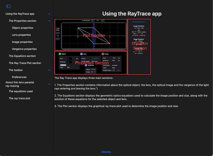
Unfortunately, I was not satisfied with the Help system when it was presented in a sheet. The sheet had a fixed width that could not be modified, and its height was limited to about half the screen size at most. This meant that the Help topics were truncated unless I widened the topics list manually after the sheet was presented. Also, very little of the Help text could be viewed underneath the Image containing the screenshot being discussed. So I used another approach, bringing up a full screen cover to display the Help system. It would offer me all the space I needed to view the Help by hiding the rest of the UI:
// At the top of the RayTraceView’s definition…

@State private var presentHelp = false

// Within the Toolbar’s ToolbarItemGroup….

Button(action: {
    presentHelp = true
}) {
    Image(systemName: “question mark.circle”)
    Text(“”)
}
.fullScreenCover(isPresented: presentHelp,
				content: { HelpView() })
The only real challenge that I had in writing the app was in displaying the Help content. For the Help display, I had to learn how to create a NavigationSplitView to display the Help topics and subtopics in a List View on the left side and the Help information on the right side changing when the user selected a topic.
Thankfully, there are many SwiftUI tutorials available online, both articles and videos, as well as many SwiftUI books. It’s easy to find books and tutorials that are updated for the latest version of Swift, iOS and SwiftUI. This is all in sharp contrast to Xojo. I had the problem of how to best display the Help info solved within an hour with the aid of online articles. There’s also a wealth of SwiftUI libraries available on GitHub, but to be honest, not all of them are kept up to date, so test them out in a fresh separate project before adding them to your app’s project.
With a bit more work, I could probably make the app work on an iPhone too. I’d just need to navigate between the various top-level Views due to the smaller screen size of the iPhone. However, I think that it would make the app less useful since the user would see only partial information at a glance. It’s nice to see everything at once, so I’ve limited the app to the iPad. I’ve also enabled my views to rearrange themselves if the device orientation is changed so everything will still be visible.
Of course, there’s a lot more I could add to the app, but this is a nice start, and the app already does more than my Xojo program did. In a future version, I might add onboarding (walking new users through the program features) by tapping into some onboarding libraries for SwiftUI available on GitHub, and I might localize the app for other languages. I might also look into adding some animation effects to some Views just to make the app “spiffier”, again for my own learning purposes.
All in all, developing the RayTrace app in Swift and SwiftUI did not take any more time than it did to write the original application in Xojo, despite adding new features, and sometimes going down the wrong path and having to correct myself after looking up information and learning better techniques. As an added bonus, the app can be run as-as on an M-series Mac too in iOS compatibility mode. I recommend trying Swift and SwiftUI if you’re ready to write an iOS app. Despite some frustrations every so often when I didn’t know how to do something, I had a lot of fun working with a new programming language and new GUI tools.
