Is anyone any good at icon design

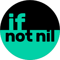
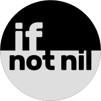
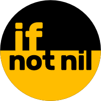
Is anyone here any good at icon design who might be willing to design a logo for If Not Nil? It can’t have escaped people’s attention that the community doesn’t have one yet as we still have the default Discourse logo in the top left corner.

Would anyone be able to help?

Richard Summers from the other forum comes to mind. I believe a few years back he switched from coding to digital design.

Oh thats so C++ :slight_smile:

Or was he a designer that got into coding ? it was never clear to me

1 Like

only way I know how to summon him is to make a post in pet peeves :stuck_out_tongue:

2 Likes

Do I have to spin around three times and click my heels at the same time? :slight_smile:

1 Like

I’m not a designer, but I can play with the idea…

slice1
slice2
slice3
slice4

Ooh I like it. How about blue to match the buttons on the forum?

OK, let’s try something with this blue :slight_smile:
slice1

slice2

slice3

Here is the result at 40 pixel high : slice1_2 and slice2_2 , like the curent logo.

slice4_2

3 Likes

I’d almost like to see that one dave proposed in these colors
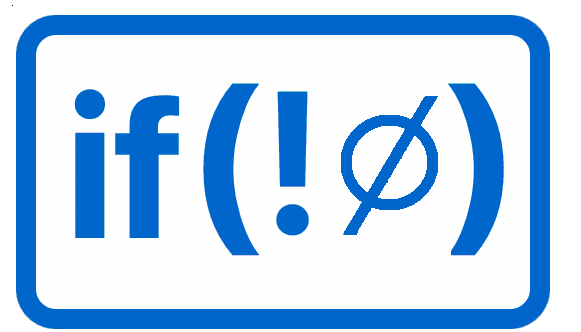
The symbol was a Swedish (?) character and the ! from C/C++ and derivatives
Not that I hate these … just it was a different thought than all words

I like the non-rounded one.

well ok…

1 Like

I actually like this one much better than the previous one you posted dave

@Ormente I really like these:

slice4_2

Perhaps with this as the favicon:

slice2_2

For the favicon I suspect we would need something easier to read at a small size, like this :
slice6_2slice6_3

For the logo, here are two variations (border a bit larger than the previous one):

slice4_2 slice5_2

1 Like

And something along Dave’s idea :

slice7

slice7_2

Though I like the symbolism that Dave came up with, this to me only means “Not Nil”, not “If Not Nil”. So maybe combine the “if” from the other logos with this one? Maybe even an inline if - if(!⊘).

1 Like

notnil

1 Like

yeah … this !