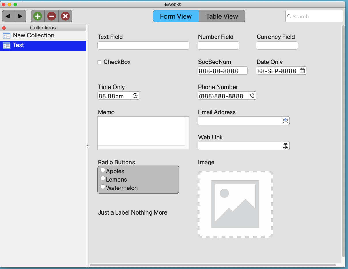
I am creating an app that is a simple flat Database , where the user can design the table by picking from a list of datatypes, and arranging them on a “form”. They control the title, size and postiion on the screen. Here is a sample with each of the datatypes shown as a sample.
The problem? It looks “pedestrian”… clinical, sterile
What options (without going overboard) should I add so the user can spruce it up a bit more?
I want the ability to “personalize” it, but with out allowing it to be “garish”
The problem with #1, is light vs dark… the user would have to define two sets of colors, or negate the light vs dark modes
The problem with #2, is the window/form is resizeable, and any picture would either have to be “centered” or have its fill/aspect changed, which could result is terrible ashtetics. #3… the field positions (actually the control sizes are predicated on a single given font)… making every label/control have its own font/size would slow down the construction/calcuation of building the form. It would be easy enough I guess to allow a flexible app level font/size #4 - see #1
These were all things I had taken into consideration… but I do still appreciate your feedback
Thanks
It not a matter of the physical layout… that is where the fields are positioned on the screen, as the user has full drag-n-drop control over that. I was hoping for suggestions as to options I could provide that might make the screen “pop”. I have since added some shadows, and a header and I think it looks a lot nicer already.
Hi Dave,
I’ma Linux user now, but I used Filemaker Pro on a Mac (System 7, 8 & 9) for quite a while. To me it looks beautiful.
I would add font selection and text size options because some fonts look better or worse depending on the screen and what’s available on to the system.
Hi Dave
I think that you have already reached the stage where you could deploy and get feedback from users with requests for improvement. The only suggestion I would make would be to be able to make some fields permanent. Ie, once data entered, turn off ability to modify them. Naturally, the lid would need to be able to be toggled on/ off
Folks will use things in ways you never dreamed of - some will be great some will be awful (recall the initial days of desktop publishing and every newsletter had 50 different fonts and was horrible to look at)
Make things possible and folks will find good, and bad, ways to use them