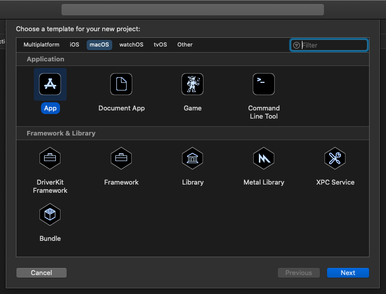
Hmmm … I could swear there were a LOT more types of projects but the pane isnt scrollable. Or is it ?
Oh sure enough - no scroll bars as a hint so now you just guess because the UI gives you no clue
All the principles that Apple once touted in their OLD HIG seem to be thrown out the window
At least macOS lets you toggle this dumb behaviour
System Preferences > General > Show Scroll Bars
but the default is “automatically based on mouse or trackpad” which means they may remain invisible unless you happen to scroll (by accident which is how I found this was a scrollable view)
yeah that was a weird choice the lower right corner
I wrote macOS software at the time and you could do whatever you wanted
Why they restricted it that way made no sense
Some old themes you could install actually altered the WDEF to permit resizing by any side or corner
Not only the scroll thing, but the looks also.
Seems the kind of UI we are used to Linux.
It’s very, very hard to maintain a high standard level of design, so, to me, Apple is working its way to set a lower bar to make this task less painful and needing less “special people” as Jony Ive.