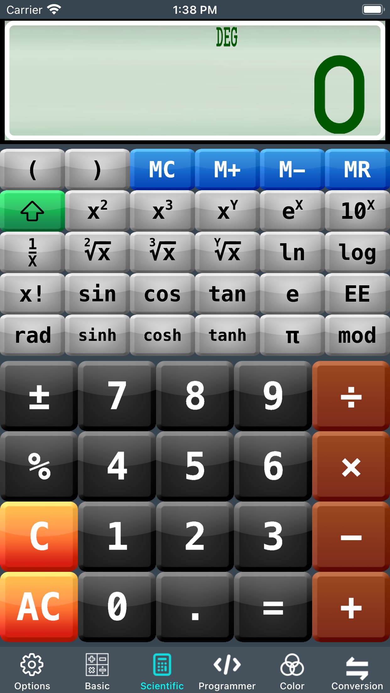
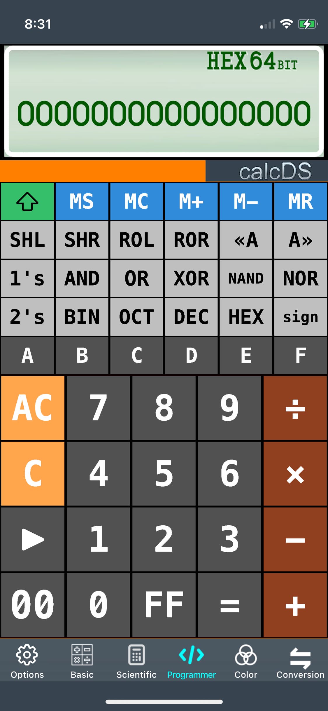
Why are you disappointed? Your calculator looks like an old Windows 95 decoction. Who wants to use something like that in these days? Come on. It’s an awful attempt imo.
So basically redo your interface. Make it modern and usable.
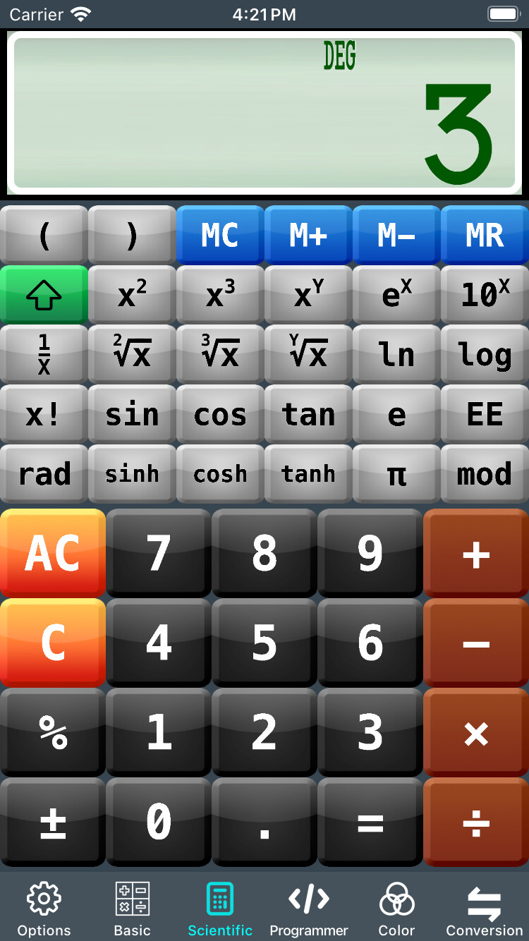
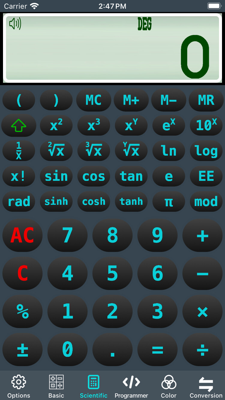
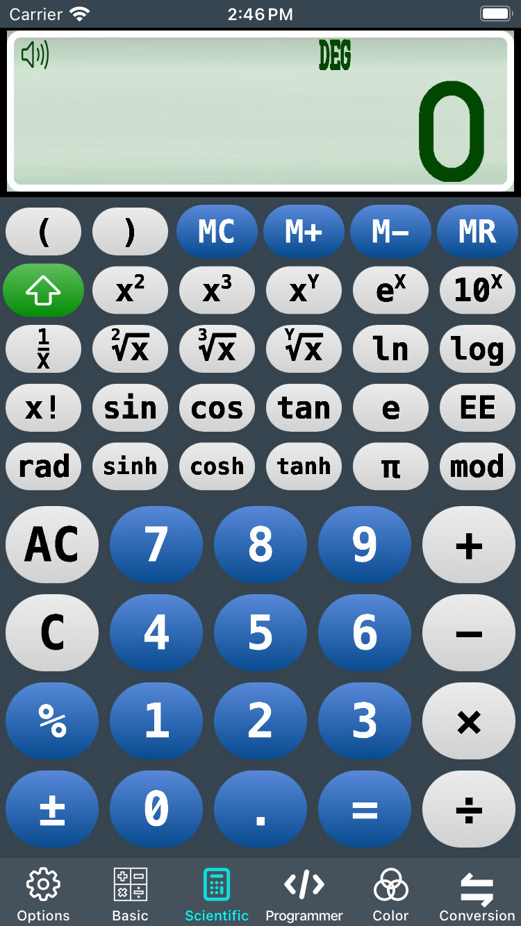
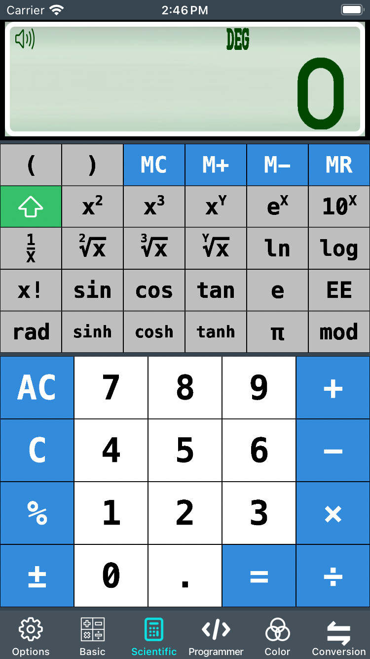
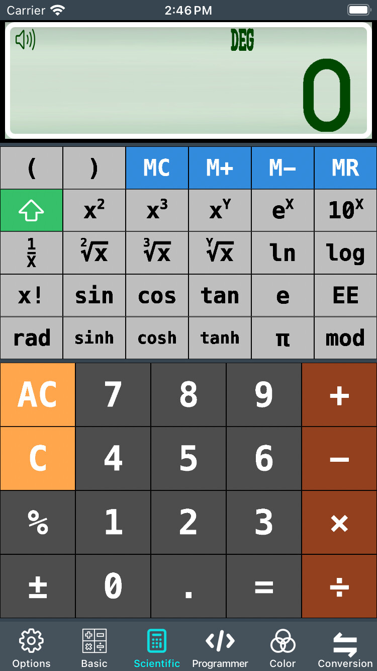
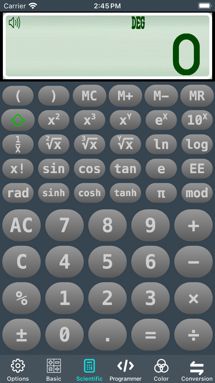
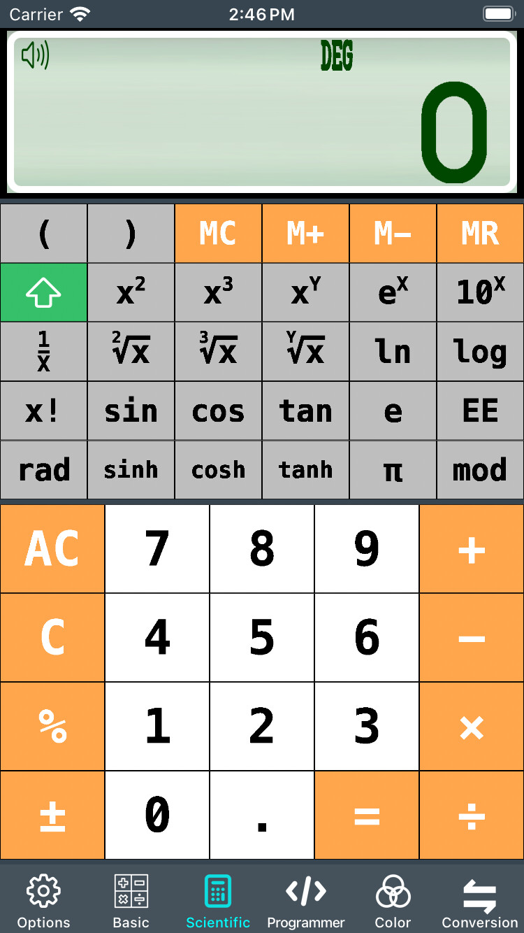
There have been some “comments” about the “retro” look… Well it seems there is no such thing as a standardized “modern GUI” for this type of app (trust me I’ve looked)… So based on what I DID find, I came up with THREE “skins”… one of them being the original
Y’know what? You’re futzing with just what you want to in just the way you like … which is what one ought to do in one’s retirement. Pay no attention to the peanut gallery. You don’t have to justify your choices to anyone.
Here’s an interesting article on bbc about visually impaired people’s issues with touch screen devices like card readers - or probably a sw calculator: https://www.bbc.com/news/disability-67239870