Announcing XUI: A Commercial Cross Platform UI Control Library For Xojo

Hello everyone,

I’m really pleased to announce the immediate release of the XUI Desktop framework.

What is XUI?

XUI (pronounced Zoo-ee) is a collection of gorgeous cross-platform user interface (UI) controls and helper/utility modules for Xojo. Frustrated by the current choice of offerings of UI controls by other third parties and the specific lack of certain controls I set out to create something better.

It is 100% API 2.0 code and 100% Xojo code with no dependence on declares.

What’s included?

XUI is sold as unencrypted source code.

XUI is continually evolving. I have a roadmap with more controls to come. Here are a few of the controls included with the current release:

Code Editor

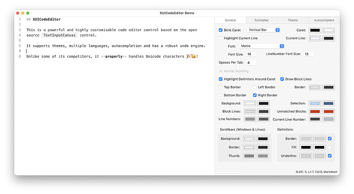
The XUICodeEditor is a highly customisable syntax editor that supports autocompletion. It’s polished and beautiful. It’s designed to handle code samples of around 500 - 1000 lines of code with high performance. It comes with support for Xojo, Markdown and Wren out of the box but writing your own formatters is easy to do. I have released open source code editors in the past but this is the fastest, most extensible one yet.

Source List

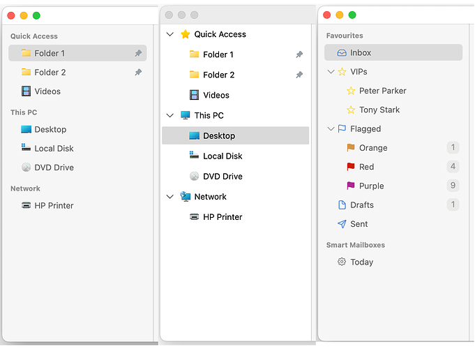
15 years ago I released my first ever commercial control (FGSourceList) that was the goto source list control for developers for years. XUISourceList is it’s modern replacement and it is better in every conceivable way. It looks fantastic on macOS and Windows and is high performance.

Tab Bar

Finally, a good looking tab bar control for Xojo! It supports custom renderers so you can make it look like whatever you like. It comes with a macOS Safari and Windows Edge renderer out of the box but defining your own is simple.

Tag Canvas

I’m particularly proud of this control. The tag canvas parses text into tags that are clickable and customisable. It also supports autocompletion. Play with the demo to get a feel for it.

Color Swatches & Color Picker

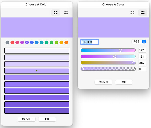
Yes I know Xojo provides access to the native OS color picker but I dislike the asynchronous nature of their implementation so I created my own. Supports real time colour selection, colour component selection and a beautiful hand selected palette of colours.

Utilities & Helper Modules

Over the years I have released a lot of open source code. A lot of this is used internally by XUI and needs regular maintenance. In order to sustain development, a lot of my helper open source code has been pulled from GitHub and folded into XUI. A few of the modules are listed below:

MarkdownKit

A 100% CommonMark-compliant Xojo parser that can convert Markdown to HTML in a single line of code. Provides access to the abstract syntax tree so you can render it how you please.

String Extensions

Many helpful methods for working with Strings.

XUIMaths

A foundation library for mathematical functions used throughout XUI.

Documentation

The framework is comprehensively documented

XUI Docs

In fact, the documentation site was built from the IDE descriptions of the framework’s properties and header comments at the top of every method.

How Do I Get It?

XUI Website
Demo App
License Purchase Page

XUI is commercial software and is sold as the full unencrypted source code. You get 12 months of updates and support. After that 12 months you can renew if you like (optional and not enabled by default) to continue to get updates and support.

There are two licenses: Personal (£150) and Pro (£300). The only difference is that Pro provides a license for all employees of an organisation whereas the Personal license is just for a single developer.

Payment is handled securely through Stripe.
6 Likes

Looks amazing! Great work.

1 Like

It looks really interesting, jut a detail, having used the B4X XUI library for some years, the name souns a little odd :sweat_smile:

1 Like

Hi @Garry, I just tested the demo app and it is a great work, but kind of dissapointing on the available features :frowning:

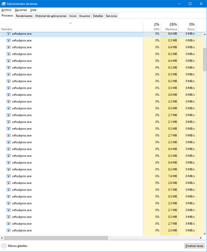
The app itself takes 10 seconds to launch on a high end PC, not to encouraging. Also, after loking at the demo app some thimes, my PC start to behave slow, looked at the process manager and…

SourceList:
-When resised the windows, Scrollbar appears but does NOT work
-Nor the mouse scroll wheel
-Cant select the top level items (or at least raise an event if not selected)
-Expected to doubleclick to colapse/expand
-Expected functionality with arrow keys (change selected item, collapse/expand)
-It is NOT theme aware, so it it useless when the app is running on a high contrast scenario
-It lacks a “Native” renderer
-It lacks a contextual menu for the items
-Collapse and expand icons need a hover state being generous, also a pushed one

TabBar:
-It should NOT change the widht of the tabs depending of the “icon” size
-It should resize the icon to the correct size for the tab
-Right menu position should never be greater than the control width
-Right and left menus Need a pressed state
-Right and left menus should be availablein all renderers
-It is not that useful if you dont have a way to access not visible tabs
-You should not resize the tabs while the user has its cursor on the controls, (closing tabs for example, really annoying if you want to close a bunch and the close button keeps moving)
-if you drag a tab to fast, the tab dont follow the cursor but the space created for it does
-It is NOT theme aware, so it it useless when the app is running on a high contrast scenario
-It lacks a “Native” renderer
-It lacks a contextual menu for the tabs

TagCanvas
-It really needs support for the arrowkeys
-Why cant the parser recognize the tag directly? (If you type “us” nothing happens, you have to type the full name)
-The close button needs a hover state

TextButton and all the other controls
-Needs a hover state
-should NOT react on all the mouse buttons, ONLY on the primary button.

Hope you find this usefull

1 Like

Firstly, thanks for taking a look and for the feedback. It’s appreciated.

It’s worth stating up front that I’m primarily a Mac Developer and whilst I do test on Windows many issues always crop up later as Xojo is simply not as good on Windows as it is on macOS.

Sigh. After investigating, this seems to be a Xojo framework bug that is at least 3 years old: Feedback crashed and maxed my CPU with lots of cefsubproc.exe - #19 by Norman_Palardy - General - Xojo Programming Forum

The app is slow on Windows because I instantiate the demo windows in the background and hide them (I could change this behaviour). The Markdown demo window uses a HTMLViewer to provide a preview (its ironically not actually part of my controls) and it would seem that there is a major bug with this control leaking Chromium embedded processes. Grr. I should be able to fix that by simply removing that control from the Window.

Let’s tackle the other bugs:

SourceList

When resised the windows, Scrollbar appears but does NOT work
Nor the mouse scroll wheel

Since SourceList is a native DesktopListbox embedded within a DesktopContainer this appears to be a Xojo bug.

Cant select the top level items (or at least raise an event if not selected)

Hard to reproduce but I have seen this when messing about quickly resizing the window. This must be a Xojo bug as well since, again, the control is a subclass of DesktopListbox and the control is simply not registering the click.

Expected to doubleclick to colapse/expand

This doesn’t seem to be the default behaviour in Finder or Mail on my Mac but I can add this.

It is NOT theme aware, so it it useless when the app is running on a high contrast scenario

A but harsh to call it useless but you are correct, the only “theme awareness” the current renderers have is light / dark mode. As far as I’m aware, Xojo does not provide a cross-platform way to get this information without declares. If there is a need for it then I could investigate.

It lacks a “Native” renderer

Not sure what you mean by this. It’s renderers are custom classes that do the drawing.

It lacks a contextual menu for the items

I can add that.

Collapse and expand icons need a hover state being generous, also a pushed one

This can be added by tweaking the renderer code in the download or by writing your own renderer.

Tab Bar

It should NOT change the widht of the tabs depending of the “icon” size

I can fix that. Assumptions were made about icon size during development.

It should resize the icon to the correct size for the tab

Agreed. That can be fixed.

Right menu position should never be greater than the control width

I’m not seeing this.

Right and left menus Need a pressed state

Good suggestion.

Right and left menus should be availablein all renderers

Disagree. The whole point of the renderers is to mimic the functionality in other apps / systems. Some simply don’t have an elegant design for their position. You can always add one yourself though - the renderers are very flexible.

It is not that useful if you dont have a way to access not visible tabs

Again, this could be added in a renderer but the renderers included mimic existing apps on macOS and Windows. I can write one that does this if you provide a screenshot.

You should not resize the tabs while the user has its cursor on the controls, (closing tabs for example, really annoying if you want to close a bunch and the close button keeps moving)

That is literally what current happens in Safari. You can change this behaviour in the renderer in the source code.

if you drag a tab to fast, the tab dont follow the cursor but the space created for it does

That can be fixed.

It is NOT theme aware, so it it useless when the app is running on a high contrast scenario
It lacks a “Native” renderer
It lacks a contextual menu for the tabs

See SourceList above.

Tag Canvas

It really needs support for the arrowkeys

That’s on the roadmap

Why cant the parser recognize the tag directly? (If you type “us” nothing happens, you have to type the full name)

Because the demo parselets are super simple. You can do what you like in your own parselets. I just wanted to create a quick demo.

Well, in my case Im a Windows user, this is the default behavior in windows since forever, windows users expect this.

Sorry if it sounded “harsh”, what I meant is that a significant percentage of the users of my apps, use the high contrast option due to sight problems, it is “useless” for any one who need to support users with special accesibility needs (not useless in all cases :sweat_smile:)

Well, something that renders a native look, You said that it can be used like the “Windows File Explorer” but it looks nothing like it. You can do this either by emulating (at least 2 themes to cover windows 10 and 11) or by using api to draw the OS theme. this includes using the system colors to cover the Theming awareness.

Just add more tabs than can fit in the width of the control and the right menu dissapears

Maybe Im not understanding the renderers idea :sweat_smile:

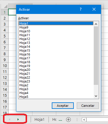
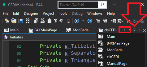
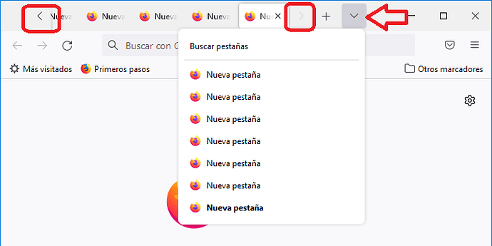
Most apps have this buttons: Previous tab, Next Tab.

image
Excel

image
B4X


Firefox

I use the way B4X, firefox and many other does it, Next/Previous buttons and a button that displays the not visible tabs in a menu.

Not using Safari here :sweat_smile: To used to the simplicity of closing many tabs without having to move the cursor chasing the close button in chrome (Firefox also dont resize tabs until the cursor leaves the control).